Pages

Monday, October 28, 2013

Echoes of Creation {thoughts on the purposes of painting}

As I make decisions about my life, my activities, and my goals, I tend to think about the big, overwhelming questions: why? to what end? for what purpose? It can tend to make me a bit of a minimalist, needing good justifications for the things that fill up my life. So, as I've been giving new time and effort to making marks in oil paint on bits of board and canvas I've also been wondering about the purpose of painting, and of art in general.

At the very least, it seems to me that there is a two-fold goodness to creating excellent paintings. The act of creating is good in itself and the act of contemplating the world through an artist's eyes is also very good.


For me, the process of painting involves the thought and learning, the logical building blocks of value, structure, perspective, color and composition, AND the emotional, physical, soulful responsiveness to a moment, a place, a shadow cast in just a certain way. And it results in a growing ability to know the world that God has made. As my technical skill (hopefully) improves, my sensitivity to the world and my ability to communicate these moments should improve as well. So far so good!


When a painting strikes you and causes you to stop and look and feel, it has changed you and provided a moment of reflection and respite. As you sit on the couch, step through the door,  or walk down the hall, a painting can suddenly arrest you with the loneliness of a windswept hillside,  the sweetness of sun-ripened fruit, or the subtlety of two colors mingling and separating.


The distinctly unique mark of the artist reminds the viewer that this object was created, this thing depicted was felt and known and re-made by a person. The painting is a communication and every brushstroke and color choice speaks of making. In it one might hear the echoes of the greater creation and the ultimate Creator and one might experience how good it is for the human soul to slow down and feel and know the world and its maker. Pretty good stuff.

So that's some of why I paint and why I want to improve and why it is good to appreciate good art. Whew, now I need a nap.

Monday, September 23, 2013

Latest Paintings {Pears and Pilgrimage}

I usually produce a couple of paintings a week, hoping the old adage, "practice makes perfect" (or better?), will produce some evidence in my work. In the last few days I've done two paintings, this group of pears and the landscape below.

I painted the pears in watercolor, outside. Outdoor painting is particularly challenging because the light is constantly changing. I'm working on blocking in the shadows quickly so that I'm not chasing the sun as I paint.

The landscape below is based on a photo I took years ago while hiking in France. It's a view of the little mountain village, Saint Savior, from the GR5 hiking trail in the Alps.  In this one I'm working on creating an interesting design that repeatedly leads the eye back into the painting.

I've toned the canvas with a wash of cadmium yellow deep and rose madder. The design is sketched in with raw umber.  You can see my pencil drawing on the left where I worked out some of the composition problems and value structures.


Here's the painting half finished. On the right is the old washed out photo (before digital!). I prefer to work from mediocre, washed out, or overcast photos for painting. I think it keeps me from trying to copy and forces me to use what I know about light and color rather than relying on the inadequate information provided by the photo.


And here's the finished painting. It's big!--30x34, painted in oil.

Friday, August 9, 2013

Working Studio {or, where I've been this summer}

After a long and winding road finishing this space and a quick summer 
attempting to recover from that project, the studio is finally in working order and I am using it daily. 


I didn't get any pictures of the beautiful butcher block counter, farm sink, and custom designed laundry area, but I will post those when I take them. Thank you so much for all you did to make this a beautiful and functional space, Mom and Alan!


I've been studying and drawing and painting (and teaching) this summer. And I'm keeping up with the laundry better too! I am so grateful for this place to work and to those who have encouraged me 
in these efforts, most notably my dear husband, Scott.


Here are a few of my most recent paintings.

Trees in Shadow, 16 x 20, oil on stretched canvas


Fallen Branch, 8 x 10, oil on linen board


Afternoon on the Trail, 5 x 7, oil on linen board


Trees in Meadow, 9 x 11, oil on canvas board


Sunday, April 28, 2013

Studio Sneak Peek

This weekend Scott's mom and stepdad came to visit and to work 
on a little project about which I am super-excited. We are converting our detached garage 
into an art studio and Alan is generously doing much of the labor to make my dream studio a reality.


This weekend he framed the ceiling and partition wall (to divide the studio side of the garage 
from the storage side), cut and installed a window, and added a door.  
{Thank you, Alan!}


Over the next month or so we'll be finishing up the electrical work, sheetrock, floor, counter and trim. We plan to install an Ikea counter and sink, epoxy the concrete floor, and I have all kinds of dreams about storage and functional design. Follow my "dream studio" board on Pinterest (see the sidebar) if you want a glimpse 
of that obsession.

The room is taking shape and I can't wait to start using it!

Monday, April 1, 2013

Making Art {an admission}

I'm doing it. I'm trying.

Do you know how hard it is for me to admit that I'm trying? The potential for failure lurks on the other side of trying. It's easy not to try. It's a little scary to try. I'm trying to make art. I'm starting to think of myself as an artist.

I've never felt comfortable calling myself an artist. It seemed to assert too much, make too bold a claim about myself and what I make. But my kids call me an artist. They tell people, "My mom's an artist." When they do that I feel a little bit like saying "Shhh!" and kicking them under the table. I haven't contradicted them, but I feel a little awkward, over-exposed. I feel a little like that right now.

A few months ago my husband told me he wanted me to have the resources I needed to focus more on my painting. He's made good on it. When I'm in the middle of a painting project, he happily makes dinner and takes care of the kids so I don't have to stop. He's awesome.

So, I'm reading about painting and materials: value, hue, composition, brushstrokes, canvas, paint, medium, and . . . so much to learn. I am excited. I'm painting more. And we're building me a studio (what?!). More on that to come . . . .

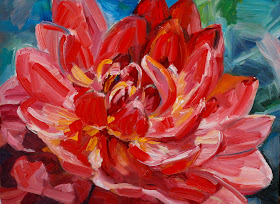
{a dahlia photo I found online}

I recently did some practicing on a pretty large scale--about 30 x 40. My dear friend, Kasey, is about to welcome her second baby--her first little girl--into their family. This little one's bedroom is already super sophisticated with horizontal stripes and deep colors. Kasey asked me to paint a large close up of a vibrant dahlia for the new nursery. It was a challenging and exciting project for me.

In my reading lately I've been learning about the importance of designing a composition based on the patterns the different values make in the arrangement (that is the lights and darks). I treated this dahlia painting as a study in value, beginning with the initial sketch made from a photo.

 {my posterized sketch}

Then I did a small preliminary painting to experiment with color.


Once I started the final painting, I tried to be constantly aware of whether the spot I was handling fell in the shadow or the light. I began with a quick underpainting in yellow ochre and ultramarine delineating these lights and shadows.


The canvas was so large that I had to make our piano in the living room into a makeshift easel. It worked out fine although I did have to pack things up for piano practice pretty often.


The finished painting is definitely my interpretation of the photo, not my attempt to copy it. I like a looser brushstroke and clean colors. I'm pretty happy with how it turned out.


And it made for some unique baby shower decor.


Look at my silly smile. Jack insisted on taking a picture of me with my painting.
Once again, I'm feeling a little vulnerable, a little over-exposed. 
It's scary stepping into the picture and admitting that I'm trying.


Friday, March 29, 2013

Watercolor Fern {or how to make a blown egg}

I have a collection of watercolor eggs that has slowly grown over the years. This year I painted a fern egg to add to the lot. These are blown eggs--the whites and yolks have been removed. 
Although they are quite fragile, blown eggs will last for years if treated gently.


If you've never blown an egg before, it's easy to learn! 
Use a needle or safety pin to poke a hole in the top and bottom of the egg.


Make sure the hole is 1/8 inch or so in diameter. 
If you are having trouble getting the whites and yolk out, make the bottom hole a little bigger.

 (No, I'm not losing my dinner.)

Then gently (but with quite a bit of force) blow through the top hole. 
The contents of the egg will pour out the bottom. Now you can make scrambled eggs! 
Rinse the egg shell and let it dry thoroughly. Then paint, sketch, dye, create!


Happy Easter!

Thursday, March 7, 2013

Green Gallery Wall {a study in landscape}

My living room has been a slow work in progress ever since we moved in to this house seven years ago.  We've experimented with a few different rugs, replaced old furniture, added a new (old) chandelier, painted the walls white, and I've tweaked and shifted things around almost daily. 
(That's one of my gifts weaknesses--don't judge!)

I recently redesigned the one big boring wall in the room by creating a gallery wall of original art. Four of the paintings are mine (three oil and one watercolor) and one painting I bought on ebay.


 The composition of the paintings on the wall was tough to figure out. After lots of unsuccessful experimenting with the four oil paintings, I realized I needed one more little one, so I rummaged around in my stash and found the watercolor which I had painted years ago.

I traced the shape of each frame on brown packing paper and cut them out to use as templates on the wall.


Once I decided on the composition, I taped them up to make sure I liked how they were centered and how they filled the space.  Then Scott and I hung the frames with a few minor adjustments and came up with this ~

 The painting on the top left is the watercolor I painted in college. It's a landscape from a photo I took in the mountains outside of Quito, Equador. The top middle is an oil I did a few months ago from a shot I took this summer while we were vacationing on the Oregon coast. The painting on the top right was done in college as well, a study of a Van Gogh. I painted the one on the bottom right a few years ago for an art show at our church.

They are tied together through color and theme, but vary a bit in style. I like gallery walls that are more random, too, but I'm loving the repeated green fields and ocean imagery in this collection.
I think it brightens up the room, and the added height and gold accents relate to the chandelier and make the room feel a little bigger to me.


Saturday, February 2, 2013

Pretty Plate Wall {high impact ~ low risk}

 When I was visiting my sister, Carrie, this fall we were inspired to jazz up her kinda-boring kitchen 
with a plate wall. I'd been wanting to try one for a while, but I've run out of wall space at my house. 
Carrie was up for some low-risk (inexpensive) decorating, so we had a great time throwing this together.


What you will need:

10-15 plates (or more?) - All of these were already owned or cost around $2 - $5 or so.
plate hangers - We used the wire ones you can get at hardware stores.
butcher paper
a digital camera
hammer and nails


How we did it:

1. We started by collecting plates. Carrie had six of these plates already, but we went to Marshall's and Home Goods to pick up the rest. We were looking for a combination of bright, bold colors, lots of texture, and a mixture of patterns and solids. (You should check out all the plate walls on Pinterest to figure out what colors and styles you like.)

 (one of our earlier layouts)

2. We played around with the composition on the floor. I'd take a picture when the layout seemed close, then tweak it a little more, take a pic, compare, tweak, pic, etc., until we settled on a composition we liked. 

3. This step could be combined with two to simplify things, but we were putting this together over a few days time so we separated the steps. I measured the space we wanted to fill on the wall, then rolled out a length of butcher paper in the same dimensions on the floor. Using the picture I'd taken as a guide, I set the plates out in the composition we'd chosen. Then I traced around each plate, drawing circles on the paper to create a template. Once that was finished I taped the paper template to the kitchen wall.


4. I chose a plate to start with (it doesn't matter which one). First, I attached the plate holder to the back. Then I held it up to the corresponding circle on the template and marked where the nail should go. (I continued using the picture on my camera as a guide.) Then I nailed right through the paper and hung the plate. I repeated that process until all the plates were hung, but the paper was still taped to the wall with nails poking through it. Finally, I took all the plates off the wall, tore off the paper (leaving the nails in all the right places, of course) and re-hung the plates.
 

Pretty jazzy, right? Well, just in the last hours before I left to return home I was hit by a second wave of inspiration ~ that old IKEA table was calling out for a quick and easy update. 
But, alas, I had run out of time.

So when I went back last weekend (to visit my sweet new little cuddly nephew) I hit the ground running 
with a plan. I lightly sanded the table, painted it green and did a few coats of wipe-on polyurethane 
on the first day. The next day I applied another coat of polyurethane to the top with a brush. 
(I wanted to be sure to get a good strong top coat since the table gets such constant use.)


The next day it was finished in all its bright, spring-green, freshness.
 I love how Carrie's kitchen turned out and it was so fun and easy to do.


If you're contemplating an inexpensive, high-impact change--I say go for it!
What do you have to lose?

Thursday, January 24, 2013

Move along, nothing to see here... {thoughts on art in the sanctuary}

 What helps you to meditate on truth?

In what environment are you most receptive to the means of grace?

How can what you see with your eye encourage your heart and mind to see?


The good news is, well, it's actually the Good News! 
It doesn't depend on us, on our faculties for attention, 
on our access to excellent environments for worship. 
It does depend on our hearing, on God's enabling us to receive his grace 
through the means which he has given.

A few weeks ago I was asked to design something to hang in the space behind the pulpit 
at our church, framing the cross, facing the congregation of the saints. 

I'm sure I overthink these things, and honestly that might normally prevent me 
from producing anything at all. But, since the time frame between being asked for a design 
and getting started on the project was around 24 hours, 
with the deadline for completion in less than a week, 
I had to move quickly and my thinking-creating-evaluating process was severely truncated.


In considering the environment, the physical context for the gathering of the church, 
for the hearing of the Word by the people of God 
I wanted to create something that, in a sense, people wouldn't see. 
Well, yes, I know they see it, but I hoped it would not call attention to itself, 
not become a distraction to those who are hearing and worshiping.

And yet, maybe subtly it could draw the eye and the heart and the mind toward Christ. 
I envisioned something rough, something ordinary, unpolished, even broken. 
I thought about vertical lines sweeping upward and about 
muddy, dark and dingy things becoming lighter and brighter.


We used ordinary, cheap, scrap wood shims, broken, battered, and discolored 
with various drab shades of paint, oriented in a vertical pattern almost imperceptibly graduating 
from a slightly darker to lighter shade of distressed, weathered wood.

I'm still not sure these panels achieve (or under-achieve) all I envision art in the worship setting should, but they're up, and they're messy, and they point heavenward. I guess I'm hopeful that we broken believers, as we gather to worship, would do the same.

--::--

Therefore, brothers, since we have confidence to enter the holy places by the blood of Jesus, 
by the new and living way that he opened for us through the curtain, 
that is, through his flesh, and since we have a great priest over the house of God, 
let us draw near with a true heart in full assurance of faith, 
with our hearts sprinkled clean from an evil conscience and our bodies washed with pure water.  
Let us hold fast the confession of our hope without wavering, for he who promised is faithful.  
And let us consider how to stir up one another to love and good works,  
not neglecting to meet together, as is the habit of some, 
but encouraging one another, and all the more as you see the Day drawing near.
Hebrews 10:19-25